Graphical Summaries
Sections 2.1 & 2.2Construct frequency distributions for qualitative data
Qualitative Data
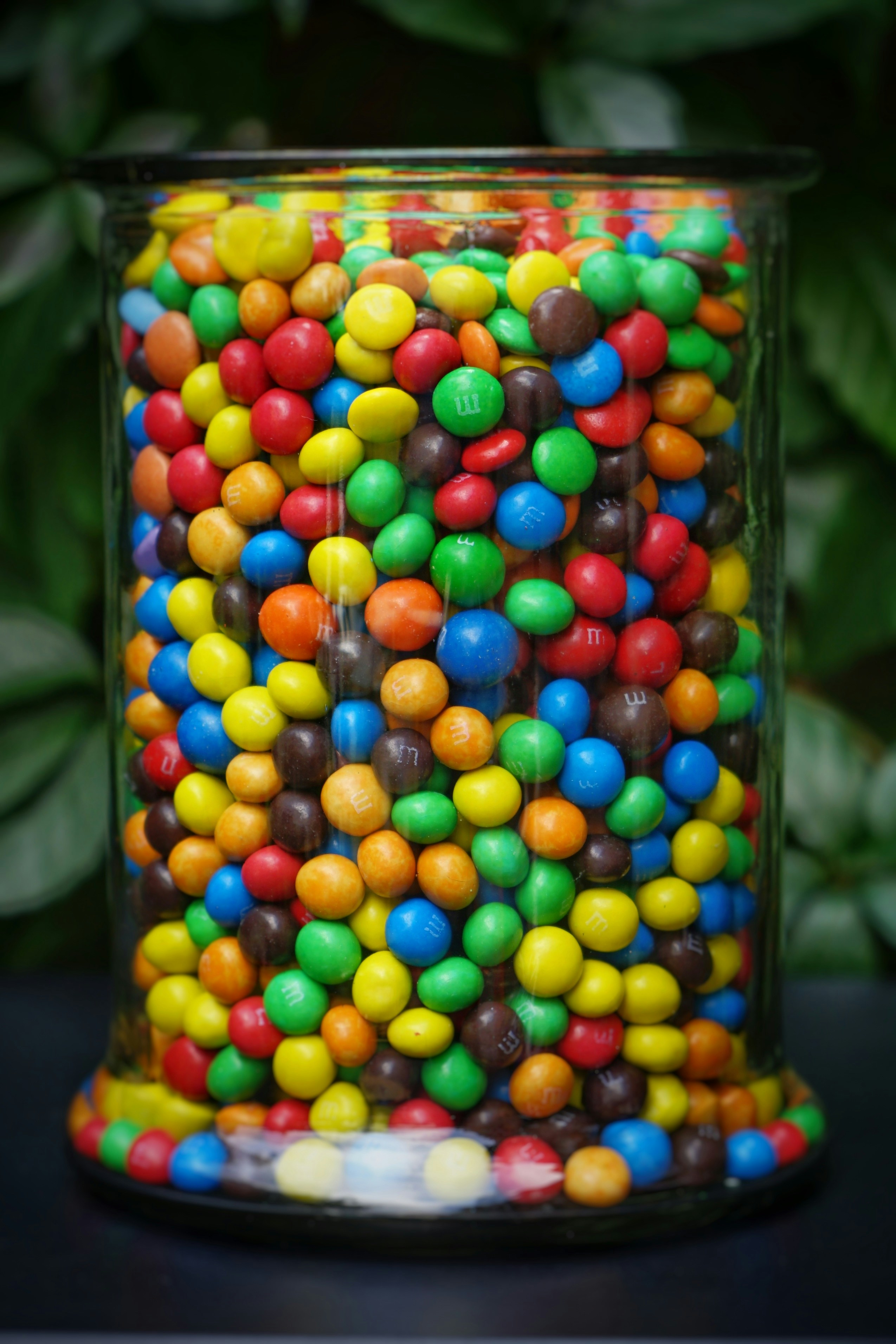
Qualitative data includes categories or labels. For example, consider the types of credit cards used by the last 50 customers at a retailer.
 Definition
Frequency Distribution
The frequency of a category is the number of times it occurs in the data set.
A frequency distribution is a table that presents the frequency for each category.
| Type of Credit Card | Frequency |
|---|---|
| MasterCard | 11 |
| Visa | 23 |
| American Express | 9 |
| Discover | 7 |
DefinitionRelative Frequency
A frequency distribution displays how many observations are in each category. Sometimes, we are interested in the proportion of observations in each category.
The proportion of observations in a category is called the relative frequency of the category.
The relative frequency of a category is the frequency of the category divided by the sum of all frequencies.
 Example
Example: Relative Frequency
To construct the relative frequency distribution for the credit card data, we begin by summing the frequencies:
11 + 23 + 9 + 7 = 50
Next, compute the relative frequency for each type of credit card.
| Type of Credit Card | Frequency | Relative Frequency |
|---|---|---|
| MasterCard | 11 | 11/50 = 0.22 |
| Visa | 23 | 23/50 = 0.46 |
| American Express | 9 | 9/50 = 0.18 |
| Discover | 7 | 7/50 = 0.14 |
Construct bar graphs
Bar Graphs
A bar graph visually represents a frequency distribution using rectangles of equal width, with one rectangle for each category. The height of each rectangle corresponds to the frequency or relative frequency of that category.
Pareto Chart
Sometimes it’s helpful to create a bar graph where categories are ordered by frequency or relative frequency. This type of graph is called a Pareto chart.
Horizontal Bars
In a bar graph, the bars can be either horizontal or vertical. Horizontal bars are often more convenient when the categories have long names.
Side-by-Side Bar Graphs
When comparing two bar graphs with the same categories, it’s best to place both graphs on the same axes, positioning the bars for each category side by side. This makes it easier to see differences between the two sets of data.
Construct pie charts
DefinitionPie Charts
A pie chart is an alternative to the bar graph for displaying relative frequency information.
The relative sizes of the slices match the relative frequencies of the categories.
For example, if a category has a relative frequency of 0.25, its slice will cover 25% of the circle.
ExampleExample: Pie Chart
The pie chart shows the relative frequencies for the credit card data. It’s customary to label each sector with its relative frequency as a percentage.
| Type of Credit Card | Relative Frequency |
|---|---|
| MasterCard | 11/50 = 0.22 |
| Visa | 23/50 = 0.46 |
| American Express | 9/50 = 0.18 |
| Discover | 7/50 = 0.14 |
 Check your understanding 1
The bar graph presents the areas of the six largest islands in the world.
Which island is the largest in the world?
Is Madagascar and Baffin Island together larger than New Guinea?
Approximately how large is Borneo?
Check your understanding 2A poll asked a sample of people the following question: Do you think things in the United States 5 years from now will be better, worse, or about the same as they are today?
Which was the most common response?
What percentage of people said that things would be the same or worse in 5 years?
Same 50 customers, four pictures
 Activity
Build a frequency distribution
| Category | Freq. | Rel. freq. |
|---|

Construct frequency distributions for quantitative data
DefinitionFrequency Distribution for Quantitative Data
To summarize quantitative data, we use a frequency distribution, like qualitative data. However, since quantitative data lack natural categories, we divide them into classes. Classes are intervals of equal width that cover all observed values in the data set.
Limits
| Class |
|---|
| 0 – 4 |
| 5 – 9 |
| 10 – 14 |
| 15 – 19 |
Limits
| Frequency |
|---|
| 2 |
| 4 |
| 9 |
| 3 |

Introduction: Air Pollution
How much air pollution is caused by motor vehicles? This question was addressed in a study by Dr. Janet Yanowitz at the Colorado School of Mines.
She studied the emissions of particulate matter, a form of pollution consisting of tiny particles, that has been associated with respiratory disease.
ExampleExample: Frequency Distribution 1
The emissions for 65 vehicles, in units of grams of particles per gallon of fuel, are given.
Construct a frequency distribution using a class width of 1.
ExampleExample: Frequency Distribution 3
Since the smallest value in the data set is 0.25, we choose 0.00 as the lower limit for the first class. The classes are then constructed using a class width of 1.
| Class Limits |
|---|
| 0.00 – 0.99 |
| 1.00 – 1.99 |
| 2.00 – 2.99 |
| 3.00 – 3.99 |
| 4.00 – 4.99 |
| 5.00 – 5.99 |
| 6.00 – 6.99 |
ExampleExample: Frequency Distribution 6
We count the number of observations in each class to obtain the frequency distribution.
| Class Limits | Frequency |
|---|---|
| 0.00 – 0.99 | 9 |
| 1.00 – 1.99 | 26 |
| 2.00 – 2.99 | 11 |
| 3.00 – 3.99 | 13 |
| 4.00 – 4.99 | 3 |
| 5.00 – 5.99 | 1 |
| 6.00 – 6.99 | 2 |
Relative Frequency Distribution
Like qualitative data, a relative frequency is found by dividing the class frequency by the total frequency.
| Class Limits | Frequency | Relative Frequency |
|---|---|---|
| 0.00 – 0.99 | 9 | 0.138 |
| 1.00 – 1.99 | 26 | 0.400 |
| 2.00 – 2.99 | 11 | 0.169 |
| 3.00 – 3.99 | 13 | 0.200 |
| 4.00 – 4.99 | 3 | 0.046 |
| 5.00 – 5.99 | 1 | 0.015 |
| 6.00 – 6.99 | 2 | 0.031 |
Construct histograms
Histogram
Once a frequency or relative frequency distribution has been created, the information can be put in graphical form by constructing a histogram. Unlike a bar graph, a histogram's horizontal axis is a number line: the classes have a fixed order and the bars touch.
ExampleExample: Histogram
The frequency histogram and relative frequency histogram are given for the particulate emissions data.
Note that the two histograms have the same shape. The only difference is the scale on the vertical axis.
Number of Classes
The number of classes can affect the shape of the histogram. Too many classes produce a histogram with too much detail so that the main features of the data are obscured. Too few classes produce a histogram lacking in detail.
Determine the shape of a distribution from a histogram
Shape of a Data Set – Skewed Histograms
A histogram gives a visual impression of the “shape” of a data set. Statisticians have developed terminology to describe some of the commonly observed shapes. A histogram is skewed if one side, or tail, is longer than the other.
A histogram with a long right-hand tail is said to be skewed to the right, or positively skewed.
A histogram with a long left-hand tail is said to be skewed to the left, or negatively skewed.
 Discussion
Would you prefer for the course grade distribution in this class to be skewed to the left or skewed to the right?
Skewed to the left — the tall bars sit at the high grades, with only a short tail trailing down toward the low ones.
Shape of a Data Set – Symmetric Histograms
A histogram is symmetric if its right half is a mirror image of its left half. Very few histograms are perfectly symmetric, but many are approximately symmetric.
A symmetric histogram with a peak in the middle is said to be bell-shaped.
A symmetric histogram in which all classes have approximately equal frequencies is said to be uniformly distributed.
Unimodal and Bimodal Histograms
A peak, or high point, of a histogram is referred to as a mode. A histogram is unimodal if it has only one mode, and bimodal if it has two clearly distinct modes.
Check your understanding 4Classify each of the following histograms as skewed to the left, skewed to the right, approximately bell-shaped, or approximately uniformly distributed.
Check your understanding 5Classify each of the following histograms as unimodal or bimodal.
The named shapes
Discussion 1Naturally occurring data follows Benford’s Law.
Discussion 2Three corporations submitted the following expenditures with their taxes.
| 79,386 | 17,988 |
| 203,374 | 80,535 |
| 11,967 | 3,037 |
| 100,229 | 132,056 |
| 46,428 | 59,727 |
| 7,012 | 38,354 |
| 957,559 | 137,648 |
| 551,284 | 4,163 |
| 97,439 | 1,279 |
| 780,216 | 21,404 |
| 22,443 | 323,547 |
| 1,023 | 194,288 |
| 238,527 | 24,346 |
| 634,814 | 695,236 |
| 850,840 | 160,546 |
| 1,393 | 865,648 |
| 47,689 | 601,981 |
| 75,854 | 262,971 |
| 5,395 | 65,407 |
| 53,079 | 6,892 |
| 3,791 | 748,151 |
| 93,401 | 45,054 |
| 129,906 | 83,821 |
| 568,823 | 228,976 |
| 4,693 | 913,337 |
| 21,902 | 252,378 |
| 437,122 | 82,581 |
| 162,182 | 338,342 |
| 7,942 | 99,613 |
| 31,121 | 78,175 |
| 64,888 | 374,242 |
| 1,643 | 12,338 |
| 832,618 | 14,204 |
| 126,811 | 31,484 |
| 13,545 | 7,818 |
| 2,332 | 104,625 |
| 29,288 | 44,178 |
| 81,074 | 3,684 |
| 401,437 | 71,665 |
| 3,040 | 15,376 |
| 244,676 | 541,894 |
| 49,273 | 65,928 |
| 112,111 | 250,601 |
| 56,776 | 650,316 |
| 262,359 | 90,852 |
ActivityBenford’s Law, corporation by corporation

Don’t Cheat on Your Taxes!
You Are Ready For:
Sections 2.1 & 2.2 HW: Graphical Summaries